Archetypal analysis, visually
2026-10-07
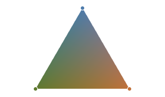
Think of a paint shop. It does not sell thousands of colours: it sells a few pure ones, and every other colour is a mix of them. Archetypal analysis (AA) does the same with data. It looks for a handful of extreme, “pure” cases, the archetypes, and describes everything else as a mixture of them.
Instead of asking “which group does this belong to?”, it asks “how much of each extreme does this have?” No maths is needed to follow the ideas below; the formulas are at the end for the curious.
Archetypal analysis looks for the pure “colours” hidden in a dataset. Let us see how it works with a simple example.
A cloud of athletes
Imagine we measured 150 athletes and drew each one as a dot. Athletes who are alike end up close together. (In statistics, each athlete is one observation.)
To be able to draw them, each athlete is described here by just two numbers, say two scores that summarise their abilities. Real data usually have many more, dozens or even thousands of measurements, but the ideas below are exactly the same; we just cannot draw them. (The data here are made up, just to have something to look at.)
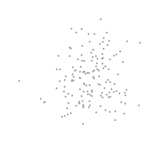
Look at the shape of the cloud: it sticks out in three directions. Near the tip of each one live athletes who are extreme in some way: very fast over a short distance, very enduring, very strong. Let us give those tips names.
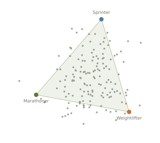
Nobody has to be exactly a sprinter, a marathoner or a weightlifter. A decathlete, for example, is a bit of all three. (Some athletes fall outside the triangle; we will get to them in a moment.) That is the whole idea: the extremes are the building blocks, and every athlete is a mixture of them. This is the first rule of archetypal analysis.
Every athlete is a mixture
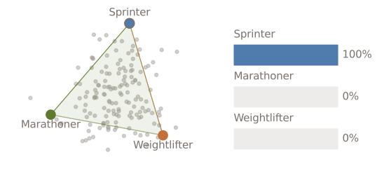
To say how much of each archetype an athlete has, we use three percentages that add up to 100%. They are the athlete’s weights. Watch one athlete walk around the triangle: the lines go to the archetypes, the bar chart shows the weights, and the dot takes the blend of the archetypes’ colours that matches them.
At an archetype, the athlete is 100% that archetype. Along an edge, only two archetypes matter. In the middle there is a bit of everything. The closer to an archetype, the larger its share.
Athletes outside the triangle
Look at the cloud again: some athletes lie outside the triangle. A mixture of the archetypes can only land inside it, so these athletes cannot be written exactly as a mixture.
AA deals with them in the simplest possible way: each athlete is described by the closest point of the triangle, the mixture that looks most like them. Watch the athletes outside the triangle slide to their closest mixture. The thin line they leave behind is what the description gets wrong.
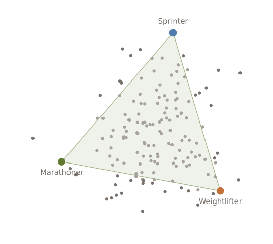
Two things follow from this. First, the leftover gap is exactly the error we will use later to find the archetypes and to decide how many we need. Second, since archetypes are built from real athletes, the triangle can never reach beyond the data: the most extreme athletes will usually be a little outside it. That is the price of keeping the archetypes realistic.
Archetypes come from real data
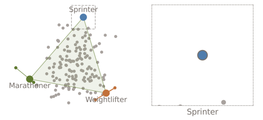
There is a catch. If we were free to put the three archetypes anywhere, we could invent “athletes” that nobody has ever seen. AA avoids this with a second rule: each archetype must itself be a mixture of real athletes.
So archetypes are extreme, but never imaginary: they sit at the edge of the data, built from observations that actually exist. You can always go and look at the athletes behind an archetype, which makes the result easy to interpret. In the figure below, the zoom visits each archetype in turn.
Archetypes are not averages
A more familiar way to summarise data is clustering: split the athletes into groups of similar athletes, and describe each group by its average, the centroid. A centroid is the typical member of a group, so it lies in the middle of the cloud. The “average athlete” of a group is average at everything, and may look like nobody in particular. An archetype is the opposite: the extreme member, on the edge.
The closest relative of AA is fuzzy c-means, a “soft” clustering method. Like AA, it gives every athlete percentages that add up to 100%, one for each group. But the percentages mean something different. In c-means they say how close the athlete is to each typical case. In AA they say how much of each extreme the athlete is made of.
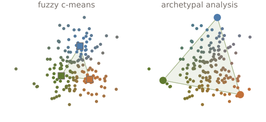
Put simply: centres answer “what does a typical athlete look like?”, while archetypes answer “what are the extremes?”
How are archetypes found?
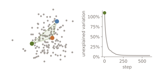
Nobody knows the archetypes in advance, so the computer finds them by trial and improvement:
- Guess. Start with three random athletes as archetypes.
- Check. Try to rebuild every athlete as a mixture of the archetypes. The gap between each athlete and its rebuilt version is the error.
- Improve. Nudge the archetypes, and the weights, in the direction that makes the error smaller.
- Repeat until the error stops improving.
It is like walking downhill in the fog: you cannot see the valley, but at every step you can feel which way the ground slopes.
To get a single number for all the gaps together, we compare them with how spread out the athletes are. We call the result the unexplained variation: at 0% the archetypes rebuild everyone perfectly, and at 100% they do no better than describing everybody as “the average athlete”. A bad first guess can be even worse than that, so the curve starts above 100%. Watch the archetypes (left) leave their random starting points and slide towards the tips while the unexplained variation (right) drops.
How many archetypes?
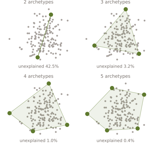
We have used three because that is what this cloud looks like. With real data we have to choose. Too few archetypes cannot describe the data well; too many make the description longer and harder to read, and eventually they stop being “extreme” and start to pick up individual odd athletes.
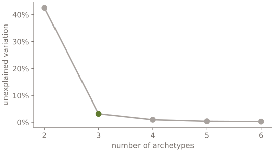
A common recipe is to try several values and watch how much variation is left unexplained.
Plotting the final unexplained variation against the number of archetypes makes the choice easier. We look for the elbow: the curve looks like a bent arm, and the elbow is where it bends, the point after which adding archetypes stops paying off.
Where is it useful?
AA shines whenever the extremes tell you more than the averages. It was introduced by Adele Cutler and Leo Breiman (1994), and it fits questions like these:
- Describing people or objects by a few extreme profiles, such as body shapes, player styles or customer types, instead of forcing everyone into a single group.
- Finding the extreme situations in data, such as unusual weather patterns, rather than their averages.
Things to keep in mind
- Outliers matter. Archetypes live at the extremes, so a few very unusual observations can pull them. It is worth looking at the data first.
- The answer is not unique. Different starting guesses can end in slightly different archetypes. Here we tried four starts and kept the best.
- Choosing the number of archetypes is a judgement. The elbow helps, but what you want to interpret matters too.
- Scales matter. If one variable is measured in grams and another in kilometres, the one with the big numbers dominates, so variables are usually put on a comparable scale first.
In short
- Archetypes are a few extreme cases that summarise a dataset.
- Every observation is a mixture of them: percentages that add up to 100%.
- Archetypes are built from real observations, so they are extreme but realistic.
- They are different from averages: archetypes sit on the edge of the data, centroids in the middle.
- The computer finds them by trial and improvement, and we choose how many to use by watching the unexplained variation.
- They are sensitive to outliers, and the solution is not unique, so look at the data first.
The maths, for the curious
Put the observations, each described by numbers, in a matrix , and the archetypes in the rows of . The weights of each observation form a matrix , and the data are approximated by
The second rule, that archetypes are mixtures of real observations, reads , where holds the weights. Fitting the model means solving
subject to , and .
says how much of each archetype every observation has; says which observations each archetype is made of. The constraints are exactly the two rules above: every row of weights is non-negative and adds up to one, so every mixture is an average. The unexplained variation shown in the figures is divided by the total variation of the data, , that is, . Distances are squared, so a value of 3% corresponds to a typical gap of about of the spread of the data.
References
Cutler, Adele, and Leo Breiman. 1994. “Archetypal Analysis.” Technometrics 36 (4): 338–47. https://doi.org/10.1080/00401706.1994.10485840.
The animations on this page are looping SVGs made with svganim.